This publication was originally posted on my previous iteration of the blog
I have a specific passion for UIs that support night and dark light conditions. But this topic is so huge, that it is hard to start writing without the risk of being lost in the theory and practice of human vision, opportunities of display devices, modern mass-market and niche approaches for edge cases (like usage in complete darkness or under direct sunlight), and so on. Nevertheless, some time ago I made a tiny research of existing dark palettes just because of curiosity, and I decided to slightly improve it and publish here.
With this research, I wanted to get the answer to the question: “What is the current established approach to the design of dark palettes among relatively modern applications, that I may consider as professional tools?”
The reasons behind
The reason of the question above is simple: quite often we need to create a dark palette from scratch, and even if we consider normal dark palette usage (not edge cases that I mentioned above), it is not always clear — should the default background be closer to black or opposite, closer to average gray (i.e. #808080), should the default content color be white or slightly darker, what is the acceptable brightness of divider between panels or table cells, and so on.
Of course, we all have our own judgments and best practices, considering multiple factors, like aesthetics, modern trends, science (like contrast ratio or adaptation of human eyes to dark condition), among others. But for me, it was interesting to see how other designers and companies solve this task, and what the average approach to it is. And I believe that it may be useful as some kind of starting reference point when we start designing a dark palette from scratch. Of course, we may (and should) adapt it to our particular needs, but as a starting point, why not? In any case, I satisfied my curiosity and want to share it here.
Process and limitations
So, the idea is to take some more or less popular “digital tools” (desktop applications) and operating systems, and collect some statistics about the following colors:
- Primary content color: default color for text content, which is typically close to white
- Main background color: default color of UI palettes, content area, whatever is more applicable
- Secondary content color: color for secondary content, that is typically somewhere in the middle between primary and background colors.
- Dividers color: main color for dividers or separators
To make it simple, I decided to limit the selection to neutral, grayish colors and ignore any hue-coded semantical colors, like the ones used for hyperlinks, warnings, and other statuses. This limitation allows us to skip all the multiple and contradictive issues with conversions of RGB values to brightness, calculations of relative brightness (subject of multiple arguments against WCAG 2.0), and so on, and also just because the selection of “colourful colors” is much more diverse. So, the result is very relative and even primitive, because it is based on the difference of RGB colors that are close to gray. But as most of us still work quite a lot with this type of color definitions (RGB, HSL), then the result will be more clear, than using much more scientific but complex calculations. And while I hope that I will continue and add more academic materials, it is more than enough for the goal of the current research.
Of course, I should mention that the selection of the applications is not comprehensive or representative at all, and that in some cases the selections of colors were very subjective (like for some apps it was hard to identify the default divider or secondary color), and other selections would definitely lead to other results. Nevertheless, I hope it is still useful — or at least gives some fun.
But enough words, let’s go to the research itself.
Overview of measurements
The first task was to select some applications and identify the colors for background, dividers, secondary, and primary content. For this, I took some screenshots of the tools I use and also tried to find relatively modern and full-scale screenshots of some other apps I was able to remember.
Also, I made a simple Qt application that visualized the color values (I don’t want to call it “brightness”, but for simplicity, let’s use this word in quotes — average value of red, green, and blue components of the colors) at the following graph:
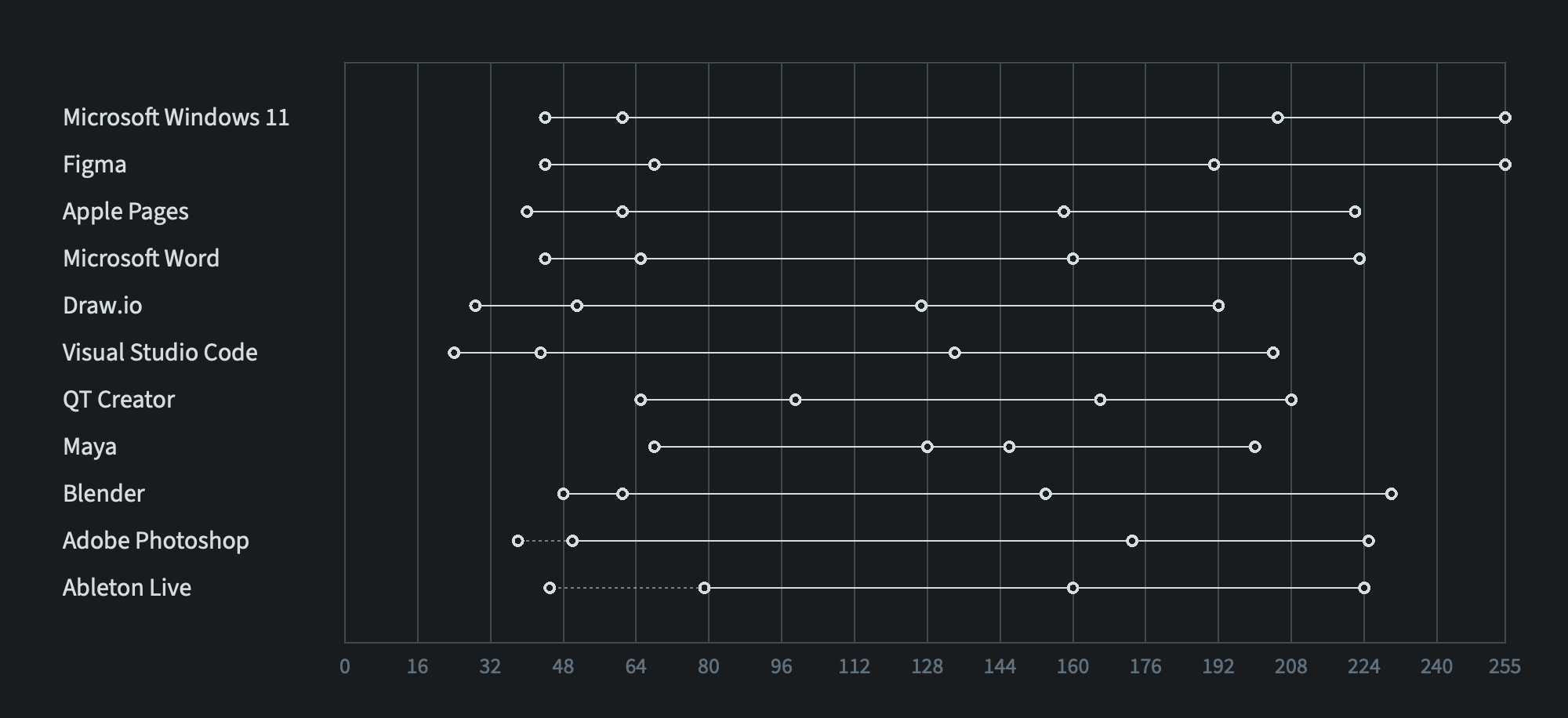
The horizontal axis represents the range of this “brightness” from 0 to 255, where I put the measurements for every application.
Most of the applications have the divider color that is slightly lighter than the background, but the last two (Photoshop and Ableton Live) have inverted dividers, which are darker than the background. So, in the first case, the left circle corresponds to the background, the second circle to the color of the divider, the third to the color of secondary content, and the right one is the “brightness” of primary content color.
Solid line connects background with primary content color, representing the “brightness” range of the palette. If the divider is darker than the background, then the corresponding circle is connected with the background circle by a dashed line.
What can we get from this graph?
As we can see without any numbers, all the applications cover only part of the available range from black to white colors, so no application utilized a fully black background with a fully white primary content color. It makes the contrast softer, and there are reasons that we will skip in this research.
But we see that the ranges of colors vary:
- Windows and Figma (relatively new UI3 palette) use the widest range with brightest white (#FFFFFF) color for primary content
- Relatively old Ableton Live dark palette has the narrowest range of brightness that is positioned in the middle of the scale. Also we can see the same tendency with other relatively old-style products, like Maya and QT Creator.
- Some palettes, like Microsoft Visual Studio Code and Draw.io, have the whole range to be shifted left, which makes them look darker relative to other palettes at the same display.
Another interesting observation: no application uses background colors that are close to the darkest available RGB colors. Even the darkest Microsoft Visual Studio Code background is almost outside of 10% darkest range, and most others fall outside the range of 15% darkest gray colors.
Also, we see that all the palettes use secondary color that is shifted right from the middle “brightness” between primary and background colors—it is brighter, and one of the reasons that if it were in the middle, it would be too dark—hence unreadable—for the selected palette range.
The last thing to comment without any extra numbers is that most of the palettes, especially modern ones, don’t use too bright dividers to avoid extra clutter. Sadly, I couldn’t find more examples for inverted dark dividers, but the last two palettes show that even with them, the difference with the background color is not that significant. I personally prefer this approach, because they don’t add too much clutter being mixed with content and other elements, but it is not possible to use them everywhere.
Numbers
Now let’s move from qualitative to quantitative approach. Based on the statistics, it was easy to get the relative “brightness” (again, don’t confuse it with the more scientific relative brightness that is used, for instance, when we calculate color contrast between elements) for the items that I consider interesting. So, based on the aforementioned observations, for every palette I calculated three numbers:
- Palette range (difference between background and primary color) in percentages of the whole 0-255 range. 100% means that the full range is used, but as I mentioned above, there is no palette among selected apps that is even close to this.
- The relative brightness of secondary color, compared to the palette range.
- The relative brightness of divider, the same comparison to the palette range.
Here are these numbers:
| Application | Palette Range, % | Secondary Color, % | Divider, % |
|---|---|---|---|
| Microsoft Windows 11 | 83 | 76 | 8 |
| Figma | 83 | 70 | 11 |
| Apple Pages | 71 | 65 | 12 |
| Microsoft Word | 70 | 65 | 12 |
| Draw.io | 64 | 60 | 14 |
| Visual Studio Code | 71 | 61 | 11 |
| Qt Creator | 56 | 71 | 24 |
| Maya | 52 | 59 | 45 |
| Blender | 71 | 58 | 7 |
| Adobe Photoshop | 69 | 70 | 7 |
| Ableton Live | 57 | 56 | 23 |
We see that the palette range for most palettes is between 65% to 85%. The relative brightness of secondary color is between 60% and 70%. The dividers quite often cover around 12% of the palette range.
Average palette
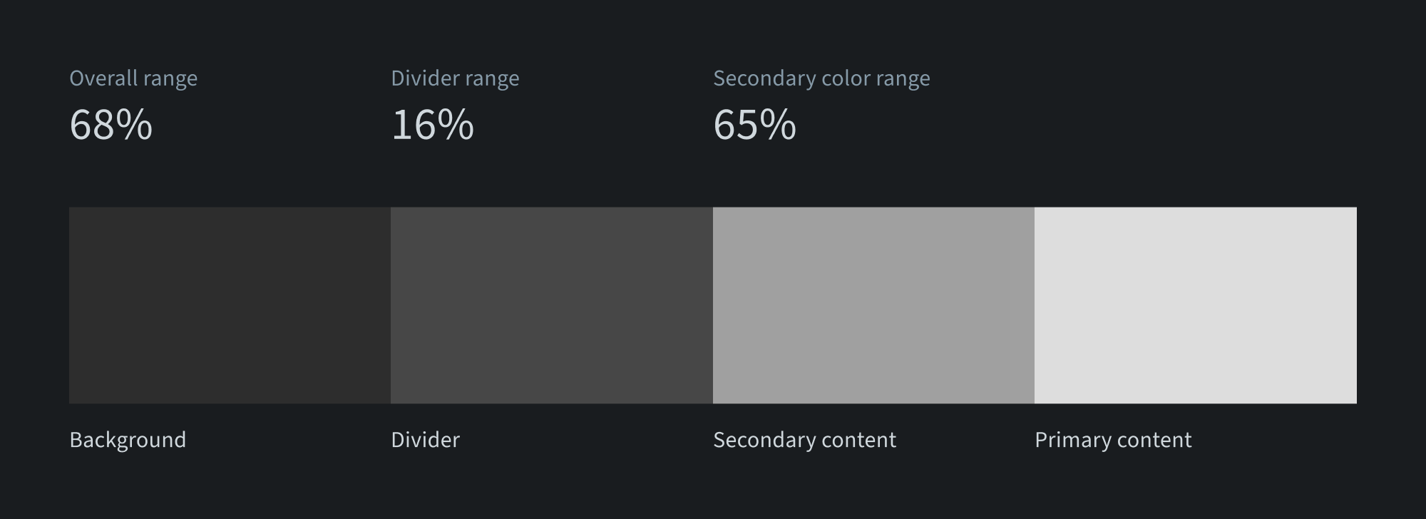
Now it is very easy to try to define an average dark mode palette based on these numbers. For this, I took all the palettes that have dividers brighter than the background color and simply calculated the average background, average divider, average primary, and secondary content colors. The resulting palette looks like this:
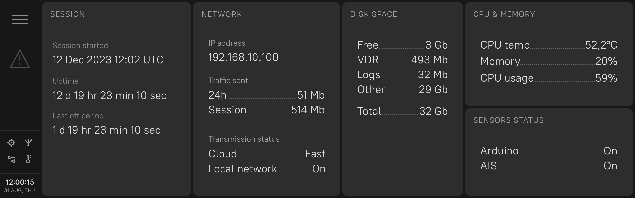
Let’s try to make a simple user interface that demonstrates this palette. I took some of the components from my Protraktor UI kit and modified the colors (I also adjusted all the necessary colors to fall into this average range, so the overall impression is not very scientific). Here it is:
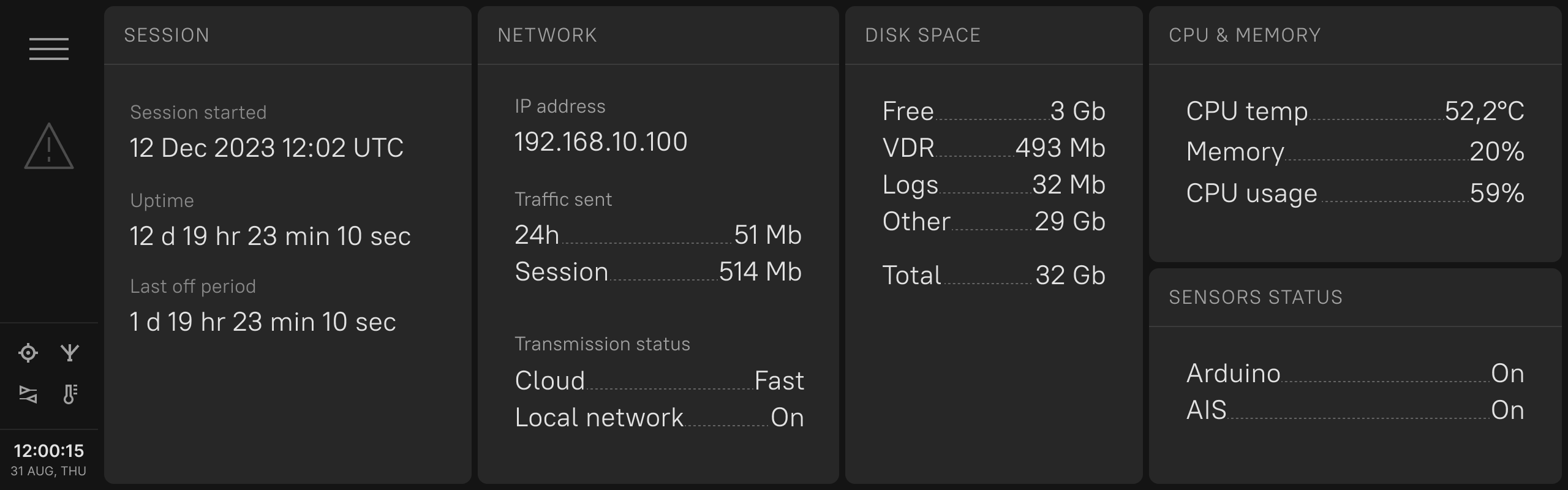
Probably, it is also good to exclude products that have too different approaches — Maya and Qt Creator. In this case, we will get the following average palette:

All the colors have slightly changed, but it looks like a current “golden standard” for dark palettes of applications — not very wide overall range, very light dividers, and sa econdary color that takes 2/3 of the overall “brightness” range. And this is the resulting sample UI based on this palette.
Both of the UIs look a bit boring, but probably not that bad as a default starting point for the next dark palette?
Conclusion
So, we got the feeling of the current average approach to dark palettes — both perceptual and quantitative. It definitely has reasons behind it to be like this, and probably it was too much to write the whole post based on the comparison of the colors.
But as I mentioned, while the overall approach is not very comprehensive and scientific, at least it raises the chances that the new palette that we are going to create will not be too dark, too light, too pale, or too bright in terms of contrast, compared to the other applications around.
Probably, it would be nice to add here some additional colors for content area background, buttons and even signal colors, but I think there should be always some space for more creative and/or scientific approach, than just by using averaged results (the same is actually applicable to the usage of AI generated assets — I wouldn’t rely too much on ready made things without extra fine-tuning).
I hope that this article was fun, and it is just a warm-up before more serious and comprehensive materials, which will cover human visual perception and UX/UI-design approaches to support it in different conditions. Let’s see how it is going to be.